UPDATE: The Death Sentence LONDON graphic novel from Titan Comics is in comic shops and book shops now,
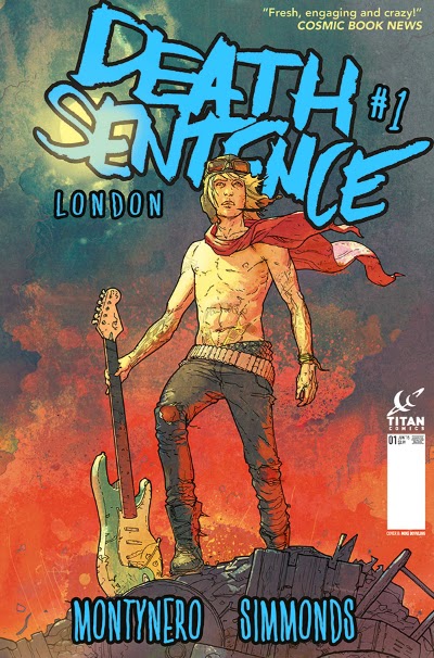
This is my favourite cover to Death Sentence: London #1, out on June 10th. I'm really happy with the feel of it so lets take a look at how the cover came together.
Fig a: Firstly I was doodling on the sofa while watching Downton Abbey on TV. That show bores my ass off, so you've got to keep busy. I was really just thinking about capturing the right mood. There's a certain feeling of reality and despair that this sketch seeemed to hint at. Death Sentence characters don't pose, or try and look tough. Obviously her left hand wasn't resolved and so on, but that's easily fixed. It's not a brilliant drawing, but I liked the feel of it so I scanned it in.
Fig b: I ink in photoshop with a pure black watercolour brush on a new layer. I think I got the brush from Imagine FX magazine about six years ago. It doesn't look smooth or neat, and it gets thick or thin very responsively to pressure. It's the closest thing I've found in PS4 to a real inking brush. I tried to sort that pesky arm out at this stage, nice and loose, and when I'd finished I dropped the transparency of the black ink layer so it looked a bit more subtle.
Fig b:
 |
|
Fig c: Next up is some colour. I mostly paint character colours with a fixed size brush called 'Ragged Hard Round' (that came with the watercolour brush). I have to change the size manually all the time, rather than use pressure sensitivity, which is fine if you use a shortcut on your graphics tab. (I paint with an old Wacom Intuos 3, never seen any need to upgrade.) The pressure sensitivity on the pen makes it easier to blend in different shades and build up colours in a free fun way.
Folds are tricky at first, you really need to study how they work like you study anatomy. But a fold is really just a highlight above a shadow, sometime sharp and jagged and sometimes soft and tubular. Once you study how and why folds are formed they're not difficult to paint, they only look wrong if you put them in the wrong place or in the wrong direction.
Fig c:
 |
|
Lighting is really the key to painting, and I find a good trick is simply to remember light primarily comes from the front, from behind you. So things get a little darker as they get near the edge (or side) of any form. Other than that it's simple three point lighting (there are loads of tutorials about that online). There's no point tying yourself in knots with complex lighting.
Fig d: The next question was what should she be sitting on? A chair? an amp? A crate of beer? Rubble? Hmm How about a big fluffy cloud or something like that?. Nah, that'll never work. ;)
I cut round the character with a selection mask to get rid of the white background, and then used a rotating splodgy kind of brush which works well for clouds or skies. It rotates randomly each time you press down with the pen so it's a case of rolling with happy accidents and erasing things you don't like until it takes on some kind of form.
Fig d:
 |
|
The pattern on her skirt is dropped on top on another layer at 50% transparency and moved about with the 'warp' tool. That way you still get all the shadow and folds you already painted in behind. I also like to add a lot of green, red and blue into the skintones at this stage, usually in bony areas (cool colours) fatty areas (warmer colours) and from different reflected light sources either side of the character.
Fig e: The angle of the figure sketch looks like we're looking down at her, so that kind of implied a view of some kind in the background. The story's mostly set in London, so the city to paint was clear. A did a quick google to find some reference photos. After staring at them for a bit I realised you basically ID London from Tower Bridge over the Thames, just like you do Sydney from the Opera House. So as long as I had that, people would recognise it as London. The other buildings I kept as simple as possible, because it's background stuff. You're painting a city, not buildings, so you don't want to get bogged down in unnecessary detail. The city blocks are literally three different shades on a fading gradient, 1 shade for top surfaces, 1 for shade side surfaces, and 1 for shadow surfaces. You might think the top shade would be lightest, but it actually worked better with the left side catching the sun. I always use square brushes for painting tech and man made structures. They come with Photoshop and you just need to load them in from the brush folder. They key thing is to make sure the colours all fade as you move back to get a strong sense of aerial perspective.
Fig e:
 |
|
At this point it occured to me that this was looking similar to Frank Quitely's brilliant Superman cover. I didn't mind that all. If this was going to evoke his work in some people's minds then that was an extra feel good bonus.
Fig f: Her cartoon face and scarecrow hair is sticking out like a sore thumb at this point. I don't think I paint hair that well, so I tried a simpler approach this time. Her hair is just two colours, mainly a mid tone with a few highlights added. I just painted a simple profile over the face rather than trying anything clever. It's okay, I'm not nuts about it. I think she lost a bit of personality at this point. To firm up these kinds of details I switch to a different brush which doesn't blend, but gives solid accurate colour with a hard edge. I used that for some of the other details like belts, bracelets, buttons too. First thing I did when designing the characters was paint all the tattoos separately on a transparent layer, as it saves Mike and Martin lots of time on the comic art. Once I positioned and warped them I just painted over them a bit to get the right tone and curvature for that area of skin.
Fig f:
 |
|
Fig g: Painting clouds and sunsets isn't complex. There's loads of ref online or out the window and with a few simple linear gradients and rotating splodgy brush marks worked in you're in business. The river's just a mask with a straight gradient from front to back. The key thing is using the right range of subtle colour variations - that's what makes it look real
At the end of volume 1 we left it a little ambiguous as to whether Verity had survived or not. You can read it several ways. This cover tells you she's in the new comic without giving too much away. Maybe she's in heaven? Maybe she flew up there? Maybe its one of her artistic illusions? Readers could make up their own minds and then read on to find out what actually happened.
Fig g:
 |
|
I wanted to inspire a spiritual, sad kind of feeling by using those unusual and moving pinks and oranges you get at sunset when golden clouds glow. It's not a colour range I've seen dominate many comic covers, so I figured it would stand out a bit.
I think I tend to 'fix things' in my drawing too much when I paint. I look at the sketch and think 'that's not accurate anatomy or 'that looks cartoony' and repaint it meticulously. That tends to kill some life from the painting in my view. I love the painting but I'm not that pleased with her face for that reason. Increasingly I'm trying to leave my 'mistakes' in the drawing because they maybe give the painting personality and energy. I'm constantly looking at my pencils and thinking 'damn, that looks better than the cover. Why did I paint that out?' But that's the great thing about art - you're always learning and evolving your technique.
Death Sentence London #1 is out June 10th 2015 and it kicks off a really cracking twelve part story. I'm just writing the last issue in that arc now, and Martin's finishing up the art to issue 5. There's another four part story after that, then a six part story, and so on. Death Sentence is basically 'ongoing' from this point on. Following up the first series was quite a challenge but I'm satisfied this is worthy. Advanced reviews have been great (see the entry below from 6th April). You should probably contact a comic store now to reserve a copy as most shops sold out last time.
http://www.comicshoplocator.com/storelocator
UPDATE: The Death Sentence LONDON graphic novel from Titan Comics is in comic shops and book shops now,
Cheers
Monty